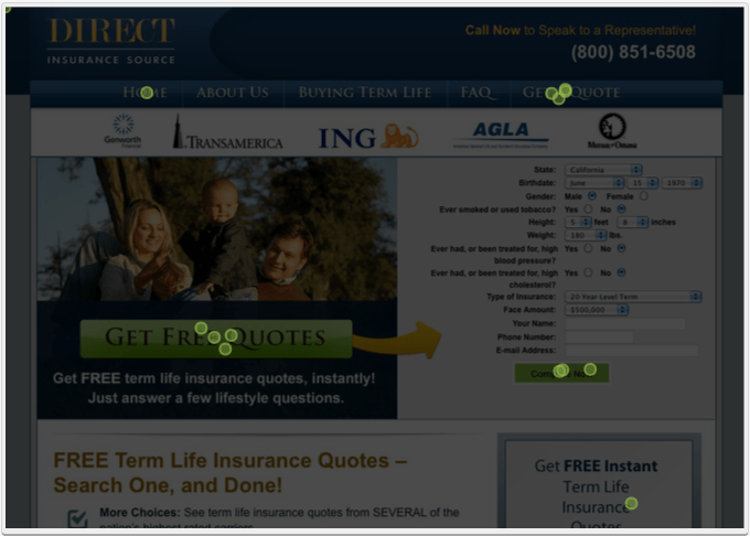
Ari Berdy & I did a click test on the Direct Insurance Source site/landing page we just launched with a service called https://theclicktest.com/. As always when you view the results it’s surprising to see where people click.
The users, real people that test these pages, were presented with the homepage of the site and told to:
“Click the item that would get you a life insurance quote”
The wording for the task may not have been optimal but was chosen so as to not lead the user to click a particular part of the screen. We didn’t want to say “click the get a quote button” or “submit the quote form” because that might guide the user to certain phrases on the page.
Test Results
Click here to review the results https://theclicktest.com/test/share/eN2nA1ilRpNzPZ6V
N.B. Out of the 13 tests, 2 should be discounted because they were done by Ari and myself. We both clicked the Compare Now button.
What We Learned
Only 1 person clicked the button we wanted them to, the Compare Now button!
Possible reasons:
- The message of Compare Now (in the context of this test) is in appropriate
- Compare Now doesn’t look enough like a button or click-able item
- Form is too long and daunting and Get Free Quotes, Get A Quote looks like an easier option to the user
Possible improvements:
- Remove Get Free Quotes callout in the middle of the page
- Restyle Get Free Quotes to look less like a button or clickable item
- Remove all links on the landing page that navigates away from users filling out the form, remove Get Free Quotes and Get A Quote from navigation for the homepage
- Make the callout containing Get Free Instant Insurance Quote clickable
- Better style the Compare Now button to a more standard looking button
- Change the copy on the Compare Now button to Get Quotes


